
CSS Multi-column Layout: Newspaper-style Columns in PDF
CSS multi-column layout sets a block of text in columns, the way a newspaper or a magazine sets its articles: the content flows from the bottom of one column to the top of the next, and the columns are balanced to about the same height. PD4ML lays out multi-column content as Chrome prints it — including sections that continue over several pages, headings that span all columns, and boxes that must not be split between columns.
.article {
  column-count: 3;
  column-gap: 7mm;
  column-rule: 1px solid #bbb;
}
Available from PD4ML v4.2.0, with the v42 layout engine: call useHtmlRenderer(Constants.LayoutEngine.v42) before readHTML(). The v40 engine does not lay out multi-column content.
PD4ML pd4ml = new PD4ML();
pd4ml.useHtmlRenderer(Constants.LayoutEngine.v42);
pd4ml.readHTML(new URL("file:report.html"));
pd4ml.writePDF(new FileOutputStream("report.pdf"));
The screenshots on this page are PD4ML output of the examples shown with them. A sample PDF with all of them is available for download.
What is supported
| Property | Values | Notes |
|---|---|---|
column-count |
a number, auto |
the number of columns |
column-width |
a length, auto |
the minimum column width: as many columns as fit (at most column-count, if both are set); the columns may come out wider |
columns |
shorthand | columns: 3, columns: 45mm, columns: 45mm 3 |
column-gap |
a length, normal |
the space between columns; normal is 1em |
column-rule |
width, style, color | a line in the middle of each gap, between columns that both hold content; also column-rule-width, -style, -color |
column-fill |
balance, auto |
balance (the default) evens out the column heights; auto fills the columns one after the other (with a fixed height) |
column-span |
all, none |
an element with all runs across all columns |
break-inside |
avoid |
on an element inside the columns: it is not split between two columns |
orphans, widows |
a number | the least number of a paragraph's lines at the bottom and at the top of a column (2 by default) |
Multi-column layout applies to block containers (display: block, list-item, inline-block). Tables, table cells, flex and grid containers are not set in columns themselves, but they can be placed inside columns.
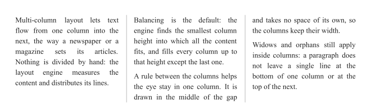
Balanced columns
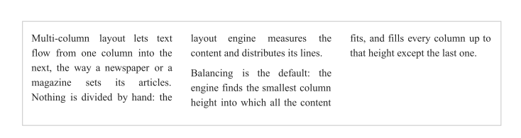
By default, the columns are balanced: PD4ML finds the smallest column height into which the content fits and fills each column up to it — every column except the last one comes out the same height. A paragraph may continue from one column to the next, but orphans and widows keep at least two of its lines together at the bottom and at the top of a column.
.article {
  column-count: 3;
  column-gap: 7mm;
  column-rule: 1px solid #bbb;
}
Columns by width
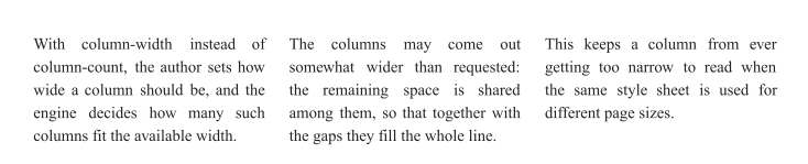
With column-width instead of column-count, the style sheet says how wide a column should be, and PD4ML sets as many such columns as fit the available width. The space that remains is shared among the columns, so they may come out somewhat wider than requested. This keeps a column from getting too narrow to read when the same style sheet is used for different page sizes.
.article {
  column-width: 45mm;   /* as many 45mm columns as fit: 3 here */
  column-gap: 5mm;
}
A heading across all columns: column-span
An element with column-span: all runs across the full width of the multi-column container. The content before it is balanced into the columns on its own, and the content after it starts a new set of columns underneath — the way a long article carries an intermediate heading that belongs to the whole text, not to one of its columns.
.article { column-count: 2; column-gap: 8mm }
.article h3 {
  column-span: all;     /* across both columns */
  background: #eef3f8;
  padding: 3pt 5pt;
}
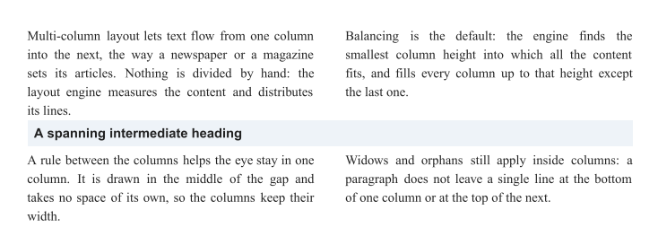
column-span applies to the elements directly inside the multi-column container.
Boxes that are not split: break-inside
Some elements should never be split between two columns: a note, a quotation, a small table or a figure with its caption. With break-inside: avoid, such an element is kept in one column; if it does not fit into the rest of a column, it moves to the top of the next one as a whole. The text around it is still distributed line by line.
.article { column-count: 3; column-gap: 6mm; column-rule: 1px dotted #999 }
.note {
  break-inside: avoid;  /* never split between two columns */
  border: 1px solid #2a5d8f;
  background: #f4f8fc;
  padding: 5pt;
  margin: 0 0 5pt;
}
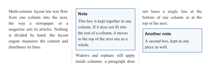
page-break-inside: avoid has the same effect.
Filling the columns one after the other: column-fill
With column-fill: auto and a fixed height, the columns are not balanced: the first column is filled up to the full height, then the second one, and so on. Short content leaves the last columns partly or entirely empty. Without a fixed height, column-fill: auto balances the columns as balance does.
.box {
  column-count: 3;
  column-gap: 6mm;
  column-fill: auto;    /* fill the first column first */
  height: 28mm;
  border: 1px solid #ccc;
  padding: 3mm;
}
Columns across pages
A multi-column section longer than what remains of the page continues on the next page, the way it is printed from a browser: on each page, the text fills the first column down to the bottom of the page, then the next column, and only then moves on to the next page. On the last page, the remaining content is balanced, and whatever follows the section starts below its longest column, at full width again.
.report {
  column-count: 2;
  column-gap: 7mm;
  column-rule: 1px solid #ccc;
}
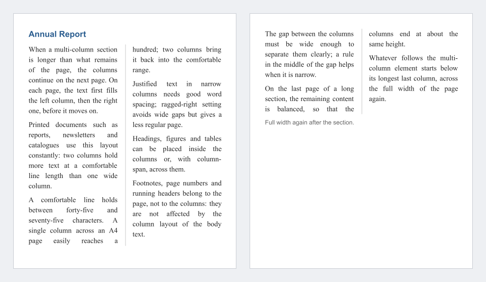
A section that starts near the bottom of a page begins there, in the room that is left: its heading is not left alone at the bottom of the page. A box with break-inside: avoid that does not fit the rest of a column on one page moves to the next column, or to the next page.
Limitations
- Column breaks:
break-before: columnandbreak-after: columnare not supported; a column break falls where the content reaches the end of a column. - Columns of different widths are not part of CSS multi-column layout; use a grid or flex layout instead, where each column is an element of its own.
- Page headers, footers and footnotes: with
<pd4ml:page.header>/<pd4ml:page.footer>or footnotes on the same pages, the columns of a multi-column section that continues over several pages may end a little above or below the actual page bottom. - Named pages and page-width changes: in a document whose pages change their width (named
@pagepages of different sizes,<pd4ml:page.break>with a new width), a multi-column section is balanced over its whole content and not continued page by page. - Nested multi-column containers are laid out, but only the outermost one continues page by page.